Our visual language is divided into four types:
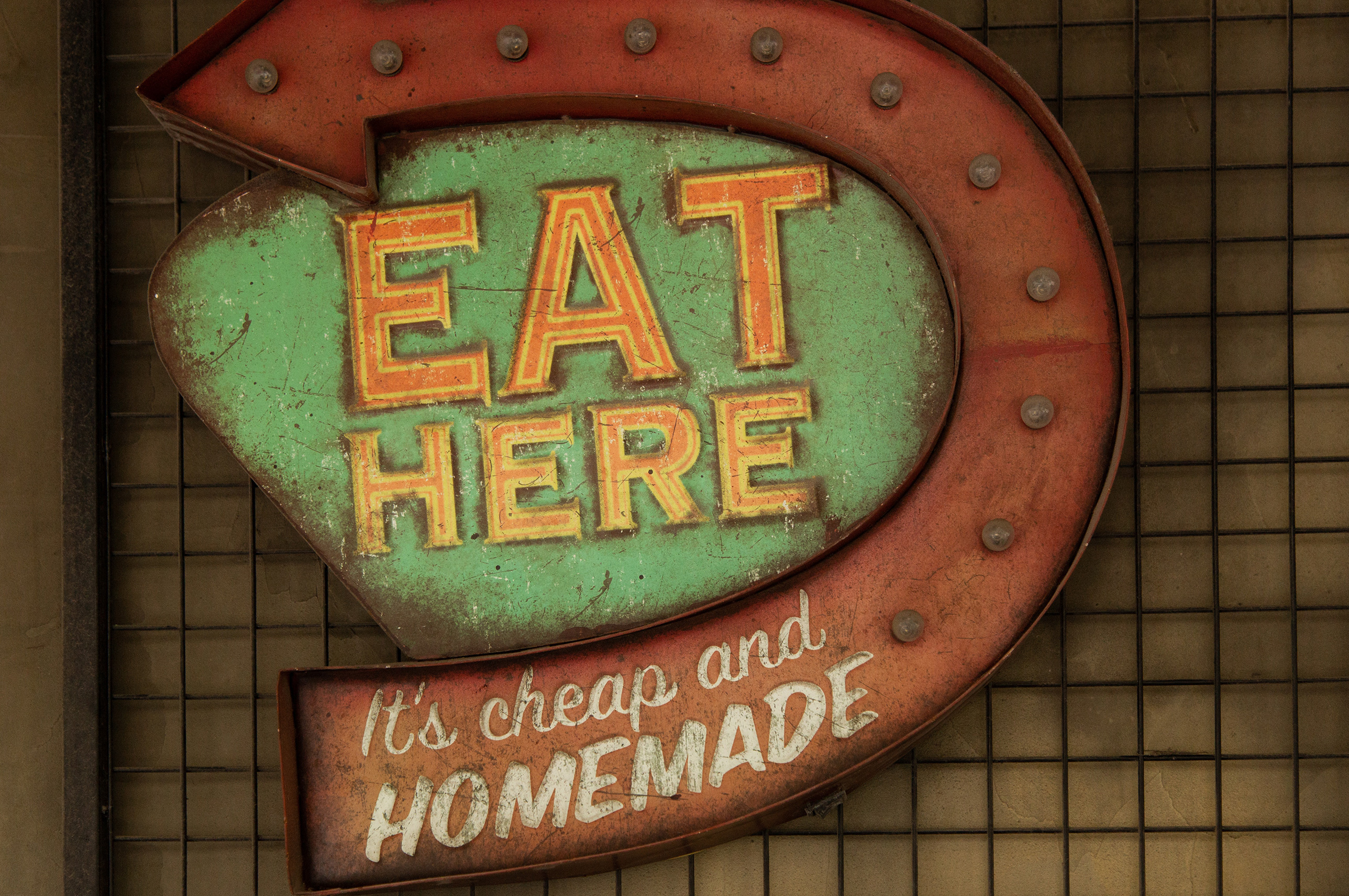
- We use object and concept photography. This can be used for blog posts, articles and presentations to communicate our ideas in a fresh and entertaining way (Fig. 1)
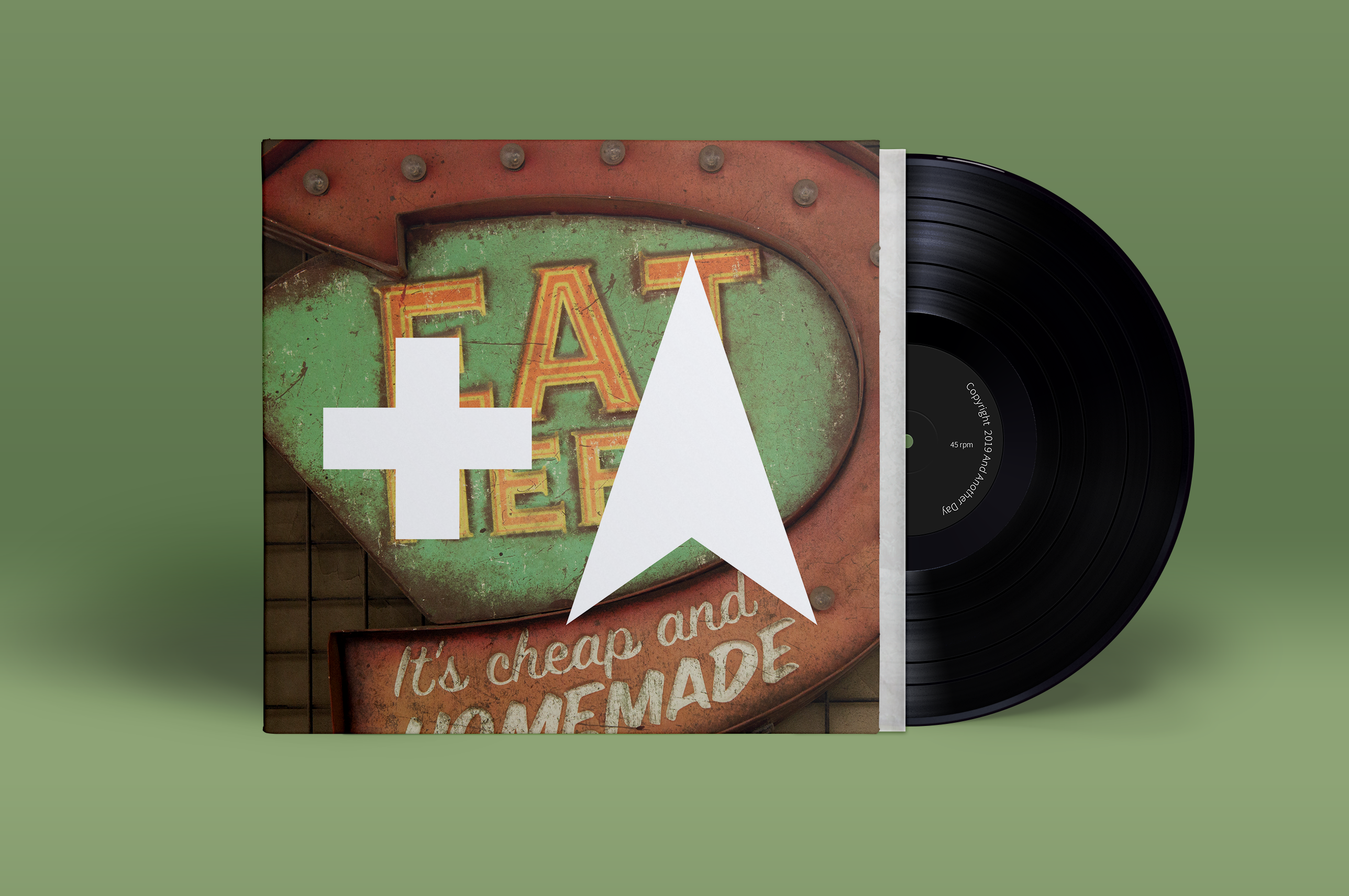
- We mix the tertiary logo with the object photography to create vinyl artwork for article previews on the website and cover pages for PDFs (Fig. 2)
- We display projects completed on a coloured background as a rectangle (Fig. 3)
- We display news, which isn't covered in an article or a project case study, in an Apple monitor (Fig. 4)